Notes on the State of Politics: Omaha Mayor, Past Voter Turnout in New Jersey and Virginia
A Commentary By J. Miles Coleman
|
Dear Readers: Today, we are leading off with some observations from Omaha’s recent mayoral election. The city makes up the better part of Nebraska’s 2nd District, a rare Kamala Harris-won but GOP-held district that is perpetually high on both parties’ House wish lists. Then, we will look at recent turnout patterns in New Jersey and Virginia, which will each host closely-watched gubernatorial contests in November. — The Editors |
Omaha: Not just blue in presidential politics anymore
Though we’ll get to the other states that are holding major elections this year a little later, we’ll start today in the Great Plains. On Tuesday night, in a nominally nonpartisan race, John Ewing, a Democrat, defeated Omaha’s incumbent mayor, Republican Jean Stothert, by nearly 13 percentage points. While Stothert, who was originally elected in 2013, was seeking a fourth term, Ewing was hardly a stranger to local politics, as he has been serving as treasurer of Douglas County (Omaha makes up almost three-quarters of the county) since 2007. If the outcome wasn’t necessarily too much of a surprise, the decisive margin was—especially considering Stothert easily won a third term in 2021.
At the presidential level, Omaha has been a Democratic-leaning city for several cycles by now: though the city was about evenly split in the 2012 presidential election, it gave Hillary Clinton a nearly 10-point margin in 2016, while Joe Biden and Kamala Harris each carried it by 19 points. But the area has generally been redder in down-ballot contests. Rep. Don Bacon (R, NE-2), for instance, has kept his losses there close enough to continually secure reelection. In mayoral races, the electorate is different from what federal contests see, as local issues get more attention.
During the mayoral campaign, Stothert was criticized from both sides for her handling of a streetcar project. Though Stothert placed first in the contest’s April 1 primary with a 36% plurality, another Republican, party-switching former state Sen. Mike McDonnell, made opposition to the city’s streetcar project a key issue—he took 20% of the primary vote. Ewing took 33% in the primary, and advanced with Stothert to this week’s top-two election.
Map 1 breaks down the election from several angles. In typical partisan elections, Democrats run up the margin in the eastern part of the city, while the western precincts, which are farthest out from downtown Omaha, are the most Republican-leaning. This was basically the case in the mayoral election.
Map 1: 2025 Omaha mayoral election
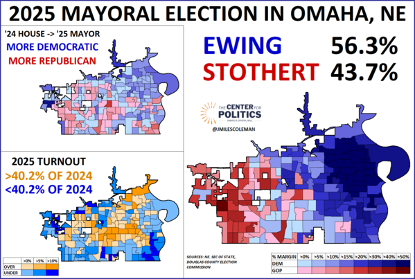
Map 1 also makes some comparisons to the 2024 House election in Omaha. Last year, the aforementioned Bacon defied public polling to defeat then-state Sen. Tony Vargas (D) in a rematch by a 51%-49% margin. This came as Donald Trump lost NE-2 by about 5 points. As part of his larger overperformance, Bacon ran more than 8 percentage points better than Trump in Omaha proper, losing it by 10.4% instead of 18.8% (this also means that Bacon fared about 2 points better than Stothert did this week). Map 1 shows the partisan swing between the 2024 House result and last night’s mayoral race. Ewing’s most consistent gains over Vargas came in the northeastern part of the city, an area that contains all of the city’s Black-majority precincts—with that, Ewing’s election is significant because he will be the first Black mayor of Omaha.
Of course, as alluded to earlier, one of the biggest complicating factors when comparing an odd-year mayoral race to a contest featuring a presidential-year electorate has to do with turnout. The third image on Map 1 aims to put the turnout differential into context. As of the data available Wednesday, Ewing and Stothert combined for about 86,500 votes. Bacon and Vargas combined for 215,000 votes citywide last year, putting mayoral turnout right at 40% of what the 2024 House race saw. In orange precincts, turnout was more than 40% of what 2024 saw, while it was under 40% in blue precincts. Though the area was somewhat mixed, several Black-majority precincts in the northeast saw relatively high turnout rates. Turnout tended to be strongest, relatively speaking, in the center of the city, with the upscale Regency neighborhood seeing some strong shades of orange. Precincts along the geographic periphery of the city, meanwhile, tended to lag behind. The southeastern part of the city contains the city’s Latino-majority neighborhoods—while shades of blue abound there, this was also Vargas’s home area, so perhaps his absence informed the turnout dynamics, or there could also just be more infrequent voters in that part of the city.
On its face, this race may not have obvious national implications: some gripes over a local project probably contributed to a Republican mayor losing reelection in a city that is Democratic at the top of the ticket. But Omaha is also the anchor of NE-2: As one of only three Harris-won but Republican-held districts in the nation, it is one of House Democrats’ most obvious 2026 targets. Though Bacon has amassed an impressive electoral record over five terms, as of late last month, he was reportedly considering retirement. Since Trump took office, Bacon has emerged as a (frequently lonely) critic of the president’s foreign policy. While it is hard to know exactly how elected officials make their electoral calculations, this week’s mayoral result could be something else that Bacon takes into consideration with 2026 on the horizon.
Turnout patterns in recent New Jersey and Virginia gubernatorial races
Late last month, we took a bigger-picture look at this year’s gubernatorial elections in New Jersey and Virginia. Today, we are going a little deeper into recent turnout patterns. In what follows, we’ll be considering the two states individually and looking at how gubernatorial turnout in 2017 and 2021 compared to what presidential turnout looked like the year earlier—2017 was a Democratic-leaning year in both states in the first year of Donald Trump’s first term, and 2021 was Republican-leaning in the first year of Joe Biden’s presidency. We will use the same method as seen above in the Omaha turnout comparison (we have also done a version of that in the context of Wisconsin’s state Supreme Court races).
Because it is our home state, we’ll start with Virginia. Map 2 shows two images of the state: the top one shows 2017 turnout as a percentage of 2016 turnout, while the bottom image considers 2021 against 2020. Again, orange indicates that a place cast a higher percentage of its presidential-year votes than the state as a whole, and blue indicates it cast a lower percentage.
Map 2: Gubernatorial vs presidential turnout in recent Virginia elections
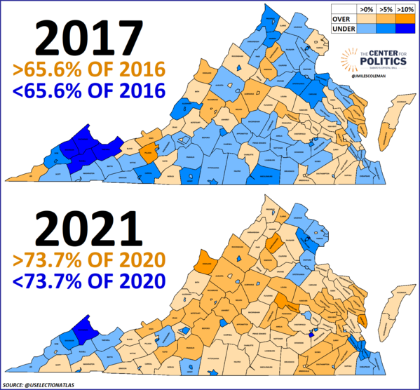
The 2017 gubernatorial race saw about 66% of the turnout that the 2016 presidential race saw. We have increasingly flagged the pro-Democratic trends along Interstate 64. Many orange localities, stretching from Williamsburg to Richmond to Charlottesville, fell along I-64 in 2017. Something that also probably helped then-Lt. Gov. Ralph Northam (D) win the election was that the core Democratic localities of Northern Virginia (such as Fairfax County, Arlington County, and Alexandria City) all saw relatively strong turnout. Meanwhile, vast swaths of Republican-leaning Southside and southwestern Virginia are various shades of blue. However, the darkest orange county, Pulaski, was also situated in the southwest: Pulaski County had a special election for sheriff that year, which could have been a factor in its relatively high turnout (let’s keep in mind that, aside from the gubernatorial elections, some localities will vote on offices that are even further down the ballot).
Still, in 2017, while the differential turnout dynamic wasn’t the only reason why Northam won, it was something that worked in his favor. Statewide, Northam defeated former Republican National Committee Chairman Ed Gillespie by a 54%-45% vote. Orange localities backed Northam 59%-40% while blue localities were about evenly split, going to Gillespie by less than 2 points.
On the bottom of Map 2, 2021 shook out quite a bit differently. Statewide, turnout rose to nearly three-quarters of what 2020 saw. The most immediate visual difference is in the number of orange localities—there were 59 on the top map, but 88 on the bottom map. Most of those blue-to-orange localities were in rural parts of the state. Meanwhile, Northern Virginia became mostly blue, as did many college towns throughout the state (Williamsburg, Charlottesville, and Lexington, which were orange in the first map, are examples).
From a partisan perspective, there was an even wider gap between orange and blue counties in 2021 than 2017. Statewide, now-Gov. Glenn Youngkin (R) defeated former Gov. Terry McAuliffe 51%-49%. Youngkin carried orange localities by about 25 points but lost blue ones by 16 points. So, one can see favorable turnout patterns for Northam and Youngkin in 2017 and 2021, respectively.
There are 50 Virginia localities that are orange in both images on Map 2. Given their relatively high turnout in recent gubernatorial races, we could reasonably expect those localities to also punch above their weight this year. Some good news for Republicans may be that those 50 “high propensity” localities backed Trump 50%-48% in both 2020 and 2024—but it also may be promising news for Democrats that, despite Trump’s 4-point statewide improvement in 2024, he did not gain in those localities.
For New Jersey, Map 3 considers the same two election years that we saw in Virginia, although the maps are little more detailed, going down to the municipal level.
Map 3: Gubernatorial vs presidential turnout in recent New Jersey elections
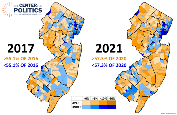
Over the two maps, now-outgoing Gov. Phil Murphy’s (D) margin went from 14 points in 2017 to just over 3 points in 2021. Even with that statewide swing, the lower-turnout blue municipalities were remarkably stagnant between the elections: Murphy took 64% in blue areas on the 2017 map and dropped only to 63% in the blue areas of the 2021 map. In both years, most of the state’s large urban municipalities (such as Newark, Jersey City, Camden, and Princeton) were in the blue category. Meanwhile, in both his elections, the relatively high-turnout orange municipalities were significantly more Republican than the state. In 2017, Murphy “only” won orange areas 50%-47%, then fell to losing them 55%-45% in 2021.
Visually, one of the biggest differences between the maps, and something that stands out most between the elections is the proliferation of darker orange in Ocean and Monmouth counties. Both counties voted markedly against Murphy in 2017, and did so even more heavily in 2021.
Coincidentally, as with Virginia, areas that were orange on both maps backed Trump by a 50%-48% margin in 2024. However, the trendline in New Jersey was better for Republicans: while the “high propensity” areas in Virginia didn’t budge in 2024, Biden carried New Jersey’s by almost 5 points in 2020, so they shifted several points toward Trump from 2020 to 2024.
In terms of the actual race to replace Murphy, there has been a notable development since our first look at the contest late last month. Earlier this week, Trump endorsed 2021 GOP nominee Jack Ciattarelli, who is running again this year. With that, we would call Ciattarelli close to a prohibitive favorite in the June 10 primary. The Democratic primary, meanwhile, is much more of a live contest: on Monday, the top contenders met at a debate, with another (and final) debate set for this Sunday.
J. Miles Coleman is an elections analyst for Decision Desk HQ and a political cartographer. Follow him on Twitter @jmilescoleman.
See Other Political Commentary by J. Miles Coleman.
See Other Political Commentary.
Related Articles

Rasmussen Reports is a media company specializing in the collection, publication and distribution of public opinion information.
We conduct public opinion polls on a variety of topics to inform our audience on events in the news and other topics of interest. To ensure editorial control and independence, we pay for the polls ourselves and generate revenue through the sale of subscriptions, sponsorships, and advertising. Nightly polling on politics, business and lifestyle topics provides the content to update the Rasmussen Reports web site many times each day. If it's in the news, it's in our polls. Additionally, the data drives a daily update newsletter and various media outlets across the country.
Some information, including the Rasmussen Reports daily Presidential Tracking Poll and commentaries are available for free to the general public. Subscriptions are available for $4.95 a month or 34.95 a year that provide subscribers with exclusive access to more than 20 stories per week on upcoming elections, consumer confidence, and issues that affect us all. For those who are really into the numbers, Platinum Members can review demographic crosstabs and a full history of our data.
To learn more about our methodology, click here.