A Tale of Two Elections: Clinton’s 2016 Primary Performance Versus 2008
A Commentary By Geoffrey Skelley
One striking aspect of the Democratic primary race was the stark role-reversal in Hillary Clinton’s 2016 performance compared with her narrow loss to Barack Obama in 2008’s Democratic nomination battle. Whereas she ran against Obama in 2008, she positioned herself as his successor at every turn during her race against insurgent Bernie Sanders in 2016. It’s very easy to see the effect of this in a county-level map of the change in her performance from eight years ago to this cycle, as shown by the coloring in Map 1 below (a choropleth map). (We recommend clicking on the map for a much larger version.)
Map 1: Clinton percentage of vote won in Democratic presidential nominating contests by county, 2016 vs. 2008
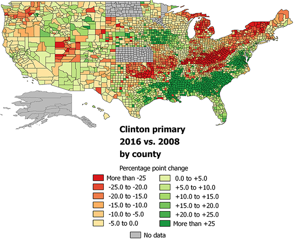
Sources: Dave Leip’s Atlas of U.S. Presidential Elections, state election websites, Politico for county-level 2016 Maine caucus results
Notes: County-level or county-equivalent-level data unavailable for 2008, 2016, or both cycles for Alaska, Kansas, and North Dakota. Minnesota’s 2008 caucus results were available by county but some 2016 results were by different geographical constituencies (such as state senate districts), making some county-level data unavailable. Utah’s data compare caucus results in 2016 to primary results in 2008. Election results are as of Monday morning, June 20, 2016. Click on the map for an enlarged version.
Because the comparison map looks at the change in Clinton’s raw vote percentage, it is worth remembering John Edwards also was in the mix during the early 2008 contests. This affects a state such as Iowa, where Clinton actually finished third in 2008 but first in 2016. Winning what amounted to a head-to-head contest in 2016, Clinton’s percentages in the Hawkeye State improved notably compared to her 2008 performance.
Overall, the two most evident differences in Clinton’s support are her improvement in the Deep South and deterioration in much of the Upper South and Appalachia. Running against the man who went on to become the first black president in history, Clinton did poorly with African-American voters in 2008. Eight years later, as a candidate who is effectively running for Obama’s third term, Clinton won over a huge percentage of black voters nationally. Her dramatic improvement among African Americans was most noteworthy in the Deep South, where the Democratic primary electorates were majority black. In fact, if we regress Clinton’s 2008-to-2016 net change on Census demographic data, the regression analysis finds that a one percentage point increase in the African-American share of a county’s population corresponds to slightly more than a one point increase in Clinton’s net result.
Conversely, Clinton did remarkably well in very white states in the Upper South and Appalachia, such as Kentucky, Oklahoma, and West Virginia, in 2008. But in 2016, her performance in large swaths of many such states fell sharply. Our regression analysis finds Clinton’s 2008-to-2016 net change decreased about 0.1 percentage points for every percentage-point increase in the non-Hispanic white share of a county’s population.
With Clinton’s role as the continuity candidate, the map is in some ways also a comparison of Obama to Sanders. Obama fared poorly in many parts of the Upper South and Appalachia in 2008, areas where Sanders ran well. Meanwhile, Sanders mainly struggled to win over black voters who supported Obama resoundingly in 2008. A look at Clinton’s home state of New York illustrates this to some extent: In 2008, Obama did six points worse in the rest of the state than in the diverse environs of New York City; in 2016, Sanders’ percentage outside of NYC was 11 points better than in the Five Boroughs.
While the universe of voters participating in 2008 and then 2016 changed considerably thanks to mobility, interest, and mortality, our map suggests that many ’08 Clinton voters became ’16 Sanders voters, and many ’08 Obama voters became ’16 Clinton voters.
Related Articles

Rasmussen Reports is a media company specializing in the collection, publication and distribution of public opinion information.
We conduct public opinion polls on a variety of topics to inform our audience on events in the news and other topics of interest. To ensure editorial control and independence, we pay for the polls ourselves and generate revenue through the sale of subscriptions, sponsorships, and advertising. Nightly polling on politics, business and lifestyle topics provides the content to update the Rasmussen Reports web site many times each day. If it's in the news, it's in our polls. Additionally, the data drives a daily update newsletter and various media outlets across the country.
Some information, including the Rasmussen Reports daily Presidential Tracking Poll and commentaries are available for free to the general public. Subscriptions are available for $4.95 a month or 34.95 a year that provide subscribers with exclusive access to more than 20 stories per week on upcoming elections, consumer confidence, and issues that affect us all. For those who are really into the numbers, Platinum Members can review demographic crosstabs and a full history of our data.
To learn more about our methodology, click here.