The Wandering Voters: How 2018’s Gubernatorial Results Reflected 2016’s Presidential Trends
A Commentary By Noah Rudnick
KEY POINTS FROM THIS ARTICLE
— 2018 governors’ races continued along the same realignment patterns that emerged in the 2016 presidential election.
— An analysis of protest third-party votes for president in 2016 indicates those voters were likelier to pick the Democrats’ side in the 2018 election.
2016’s changes endured in 2018 gubernatorial races
In 2018, Democrats won over suburban voters to cruise to a roughly 8.5-point win in the national House vote, even as the rural areas remained red. In the following writeup, I look at where each party made gains this past cycle. I also look at how third-party performance in 2016 acted as a leading indicator of where there was a group of lost voters that would pick a side, in this case for the Democrats and against the party in the White House.
The lean of a county is defined as the statewide margin subtracted from the margin in the county. For example, if the Republican won a county by 5% in a state the same candidate won by 2%, then the lean would be 3%. If four years later in 2018, the Republican won the county by 8% while winning by 1% statewide, then the county’s lean is now 7%, and the difference in the leans is now 4%. Figure 1 below shows the change in the lean from 2014 to 2018 in gubernatorial races, with red becoming more Republican and blue becoming more Democratic relative to the overall statewide margin (the states that did not have gubernatorial races last year are not included).
Figure 1. Change in lean by county from 2014-2018
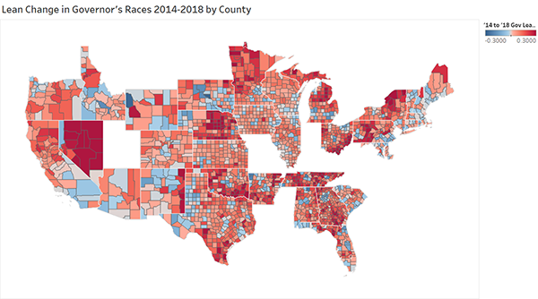
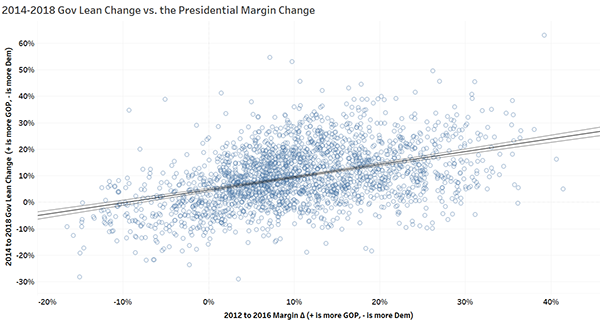
Those familiar with a county map will see that for the most part, the trends from the 2016 presidential election continued. The suburbs and cities became bluer as the rural counties continued lurching rightward. Figure 2 confirms this by showing a direct relationship that where the direction and magnitude of the margin change from the 2012 to 2016 presidential contests went, the lean change in the governor’s elections from 2014 to 2018 followed.
Figure 2. Gubernatorial lean change vs. presidential margin change by county
So, one way to figure out what happened in 2018 was to use a continuation of the trends in the margins, but there’s an even more revealing way to look at the new set of Democrats in the midterms. My personal theory is that there are now ex-Republicans, especially those from the suburbs, that on balance voted for Democrats in 2018 and make up the new swing voters. But these voters didn’t vote for Hillary Clinton, and that’s not why the margin swung from 2012 to 2016. These voters backed third-party candidates in 2016, opting not to vote for either of the two unpopular major-party candidates.
In order to test this theory, the first thing I did was devise a measure to compare minor-party performance levels across the years. I collected the third-party performance for every county in the United States in presidential elections from 1980-2016, with the invaluable help of Dave Leip’s election atlas. I then used a relative measure in order to compare the performance in one year not only to all other counties that election, but also within that county for all years going back to 1980. For example, if third parties in a county received 4.5% of the vote and 3% nationwide, then the performance here would be ((.045-.03)/.03) =50%. To compare over the years, I took the median since 1980 and compared each year to the median in that county. Figure 3 below shows the map of how third parties as a whole performed in 2016 relative to their historical baseline, with blue being a higher performance than usual and orange being a lower performance.
Figure 3. 2016 Relative third party presidential performance
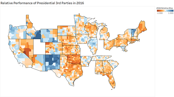
One can see some obvious patterns on this map. For instance, much of New Mexico is shaded dark blue, indicative of Libertarian nominee Gary Johnson’s relative strength as a third-party option in his home state, where he once served as governor.
The next map in Figure 4 is a combination of Figure 3 and the change in the presidential margin from 2012 to 2016. Dark red is where third-party performance was down relative to the historical baseline and the margin shifted towards Republicans, dark blue is the same but a shift towards Democrats. The light red, on the other hand, was where third-party performance was higher than usual but the margin still shifted rightward. Light blue is a high third-party share and shift towards Democrats.
Figure 4. 2016 third party and margin combined status
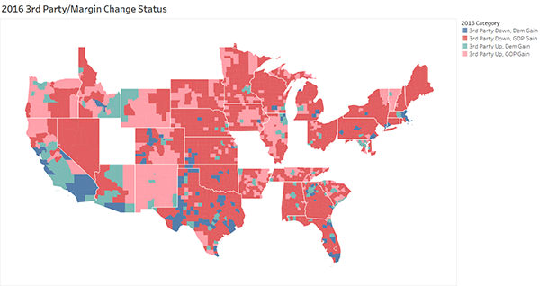
Figure 5 uses these categories and plots out the relationship with the measure from Figure 1, which charted out the change in the lean of a county from 2014 to 2018. Going up, the county got more Republican, but heading downward, a county became more Democratic at the gubernatorial level.
Figure 5. 2018 shift in county lean by third party/margin status
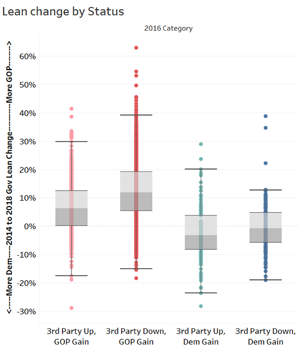
First, you can see that the marginal change by who gained had the largest impact, but third parties mattered here as well. In the category of those that moved towards Republicans in 2016 and where third parties underperformed, the lean moved 12% towards Republican as the median. But where third parties did better than their historical average, they moved only 6% more Republican, a sizable and significant decrease of several points. For the counties that moved Democratic from 2012 to 2016, counties where third parties were down only moved 1% more Democratic. Among counties where third parties were higher, the shift was only 3% more Democratic, a little higher but not significantly. The magnitude, or how much they shifted, matters as well.
Figure 6 looks at this measure by first creating an adjusted measure that centers all the states to compare them by setting the median county third-party performance to zero. I then plotted those points on the x-axis and the shift in the lean from 2014 to 2018 governor races on the y-axis.
Figure 6. 2018 governor lean shift vs. adjusted relative performance
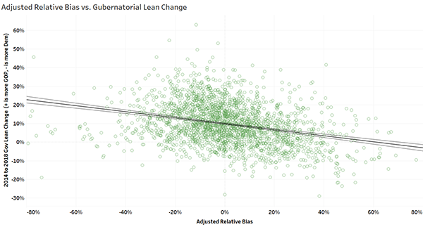
The inverse relationship here shows that as relative third-party performance increased, or as more people than normal voted third party, there was more movement to the Democrats. It also means that counties with a lower-than-normal third-party vote, the vast majority of which were rural areas, continued moving more Republican.
What does all of this tell us? In summary, that the 2016 election set in motion a split that broke heavily from the previous midterms, especially on rural/suburban lines. But we can also see that beyond a one-to-one equivalency in the margins, and especially in areas where Republicans lost ground, voters who went to a third-party candidate in 2016 seemed to break harder for Democrats in 2018, giving that party an edge. This affects 2020, as this new swing bloc could decide the election if it again breaks for the Democrats after opting out of the major-party choice in 2016 — or it could opt-out again or even drift back to the Republicans. It also means that the campaigns will have to adjust to new rural or suburban voters in their coalitions and how best to appeal to those that have strayed into the gap between the parties.
Noah Rudnick is currently a student at the Ohio State University and a contributor to Decision Desk HQ. Follow him on Twitter @rudnicknoah.
See Other Political Commentary by Larry Sabato
See Other Political Commentary.
Views expressed in this column are those of the author, not those of Rasmussen Reports. Comments about this content should be directed to the author or syndicate.
Rasmussen Reports is a media company specializing in the collection, publication and distribution of public opinion information.
We conduct public opinion polls on a variety of topics to inform our audience on events in the news and other topics of interest. To ensure editorial control and independence, we pay for the polls ourselves and generate revenue through the sale of subscriptions, sponsorships, and advertising. Nightly polling on politics, business and lifestyle topics provides the content to update the Rasmussen Reports web site many times each day. If it's in the news, it's in our polls. Additionally, the data drives a daily update newsletter and various media outlets across the country.
Some information, including the Rasmussen Reports daily Presidential Tracking Poll and commentaries are available for free to the general public. Subscriptions are available for $4.95 a month or 34.95 a year that provide subscribers with exclusive access to more than 20 stories per week on upcoming elections, consumer confidence, and issues that affect us all. For those who are really into the numbers, Platinum Members can review demographic crosstabs and a full history of our data.
To learn more about our methodology, click here.